The challenge
Geeko was founded by a group of friends who loved gaming but couldn't find beautiful and modern furniture made specifically for them. Their goal was to build modern yet functional furniture for gamers. I spearheaded the brand and web design.
BUILDING A TRUSTED BRAND
Geeko's entire future rested on the success of their crowdfunding campaign. In the end, a lot of crowdfunded projects fail or get seriously delayed; which means customers become more hesitant. We had to build a trustworthy brand.
I built Geeko's first styleguide with this goal in mind. The brand was serious, geometric, and simple. The campaign was a sucess (the team raised 550% of the initial goal), and many contributors congratulated Geeko for the campaign design.
Geeko's communication was great during and after the campaign, which helped a lot in creating this feeling of trust among customers. Now that this was established, it was time to add more personality to the brand, and express its values. Enter phase 2 of the branding, which is materialized by Geeko's new website.
Step 2 : express yourself
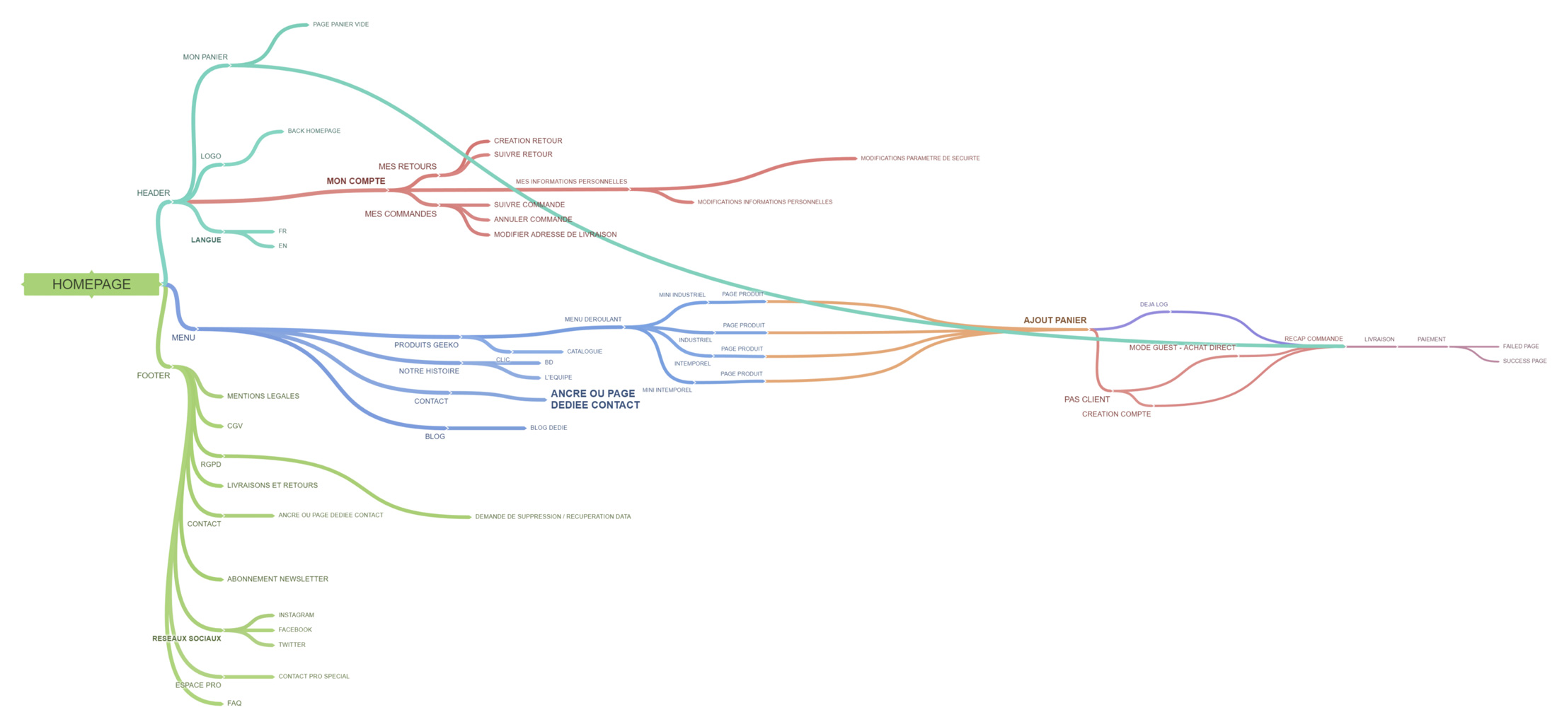
INFORMATION ARCHITECTURE
The goal of Geeko's first website was to build trust, by thoroughly introducing the concept and the team behind it. Right after the crowdfunding campaign, the goal was to shift toward an e-commerce website and drive sales.
I worked with Geeko's founders to find the better way to articulate the new website, in a way that would drive sales while providing enough information on the concept to continue building trust.

From wireframes to web design
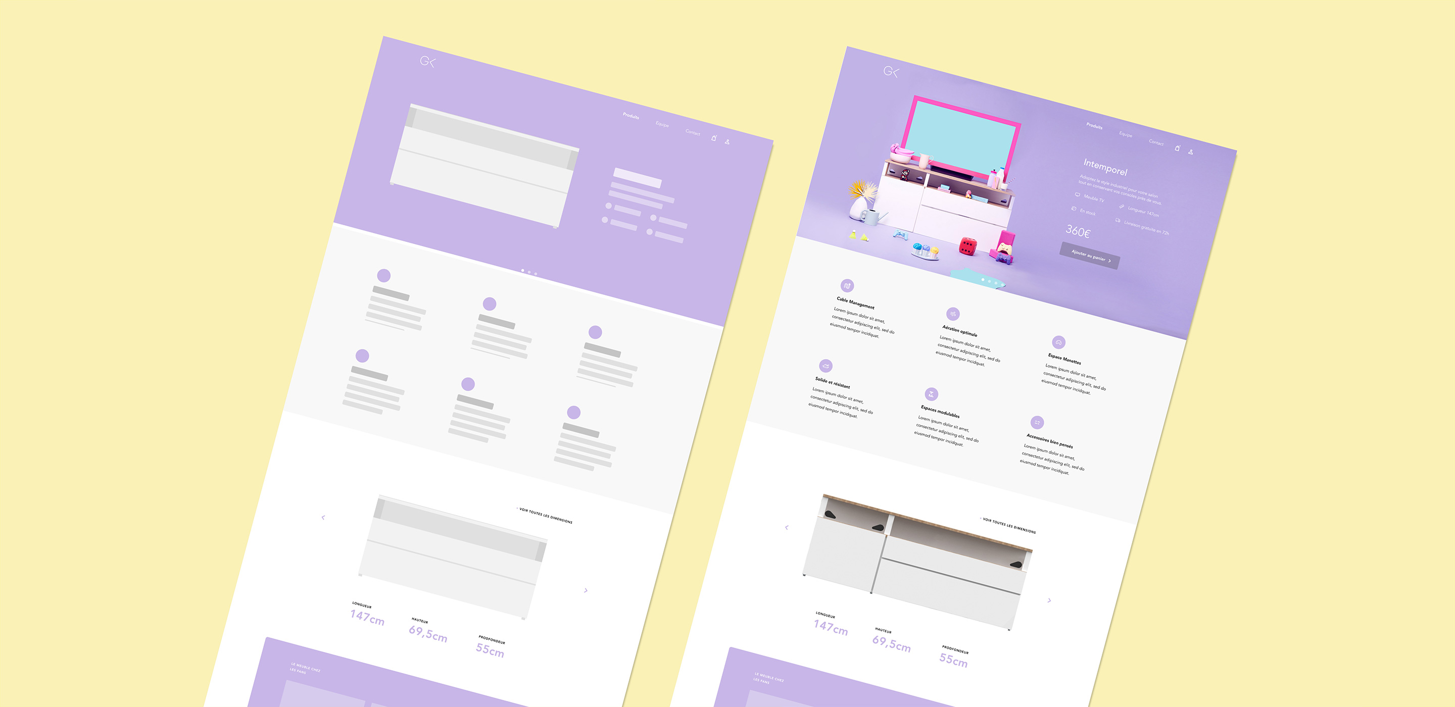
I started by building wireframes of the main page and the whole buying flow. This allowed for quick feedback between Geeko's team, their developer and me. Geeko has some great marketing and SEO experts in its team, so we managed to find an effective structure quick quickly.
As the website would be built using PrestaShop (a Shopify equivalent), I worked closely with their web developer to make sure every component was compatible with the platform.
Prototyping & HANDOFF
I built the full website prototype in Figma, which proved to be quick and efficient. Then I jumped into Webflow to create specific interaction prototypes. This allowed Geeko's team to easily preview the website and share it with friends to get some initial feedback.
After our last design review, I created a comprehensive styleguide and published it on ZeroHeight. According to the lack of Slack messages coming from Geeko's developer, a clean Figma file linked to a comprehensive and well-documentated styleguide on ZeropHeight seems to works quite well.
Results
Geeko smashed their funding goal, raising 550% of what they needed to launch the production. The e-commerce website is under development and will be unveiled in June.
