KUMPA

I founded Kumpa while I was still in college. At that time, I realized I was going for a run every single day for the sake of staying fit but didn't even enjoy it. I saw an opportunity to disrupt the conventional and boring running workout by making it fun and interactive.
I wondered what would happen if we turned running into a real-life video game. What started as a student project quickly turned into a company. I built a team, and we designed Kumpa with the following challenge in mind: help everyone get exercise while having fun.
Half of the Kumpa team attended the 2017 European Innovation Academy in Turin, an intense three-week sprint that took us from an idea to the market.
With more than 700 participants, mentors, and investors from all around the world, the Innovation Academy turned out to be the perfect place for some intensive user research. Aside from interviewing all the program participants that fitted into our personas, we spent one full day walking the streets in Milan interviewing runners, listening to their needs and challenges.
We turned these insights into different concepts and then went back outside, pitching as many people as we could. That gave us great insight as to which features could solve our users' problems and helped us refine our personas.
Kumpa targets young users aiming to have a fun, social workout. We designed the brand using bright and vivid colours that pop out and convey positive, happy emotions. As the name Kumpa is abstract, we created an icon that clearly suggests running, while still standing out from other running apps. The flashy shoe emoji brings this kind of clarity and fun to the app icon. It's a statement that tells users this isn't going to be your routine run.


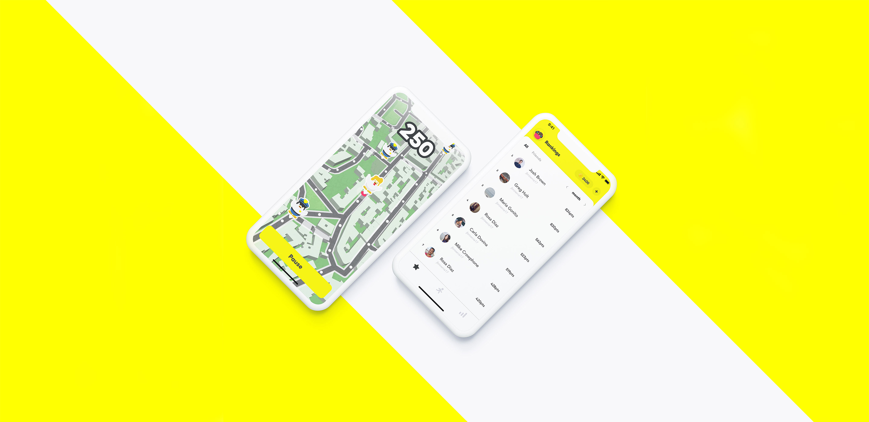
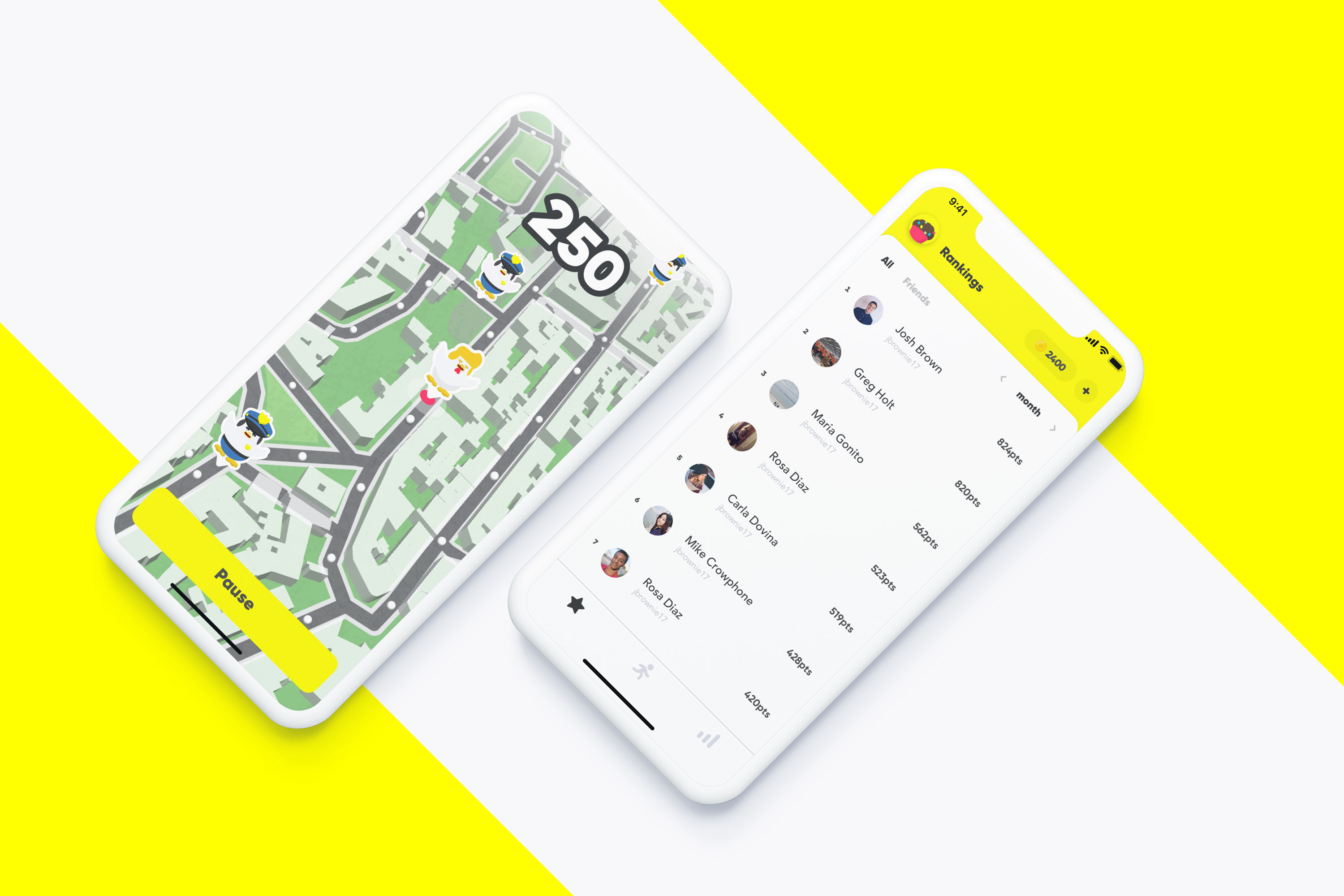
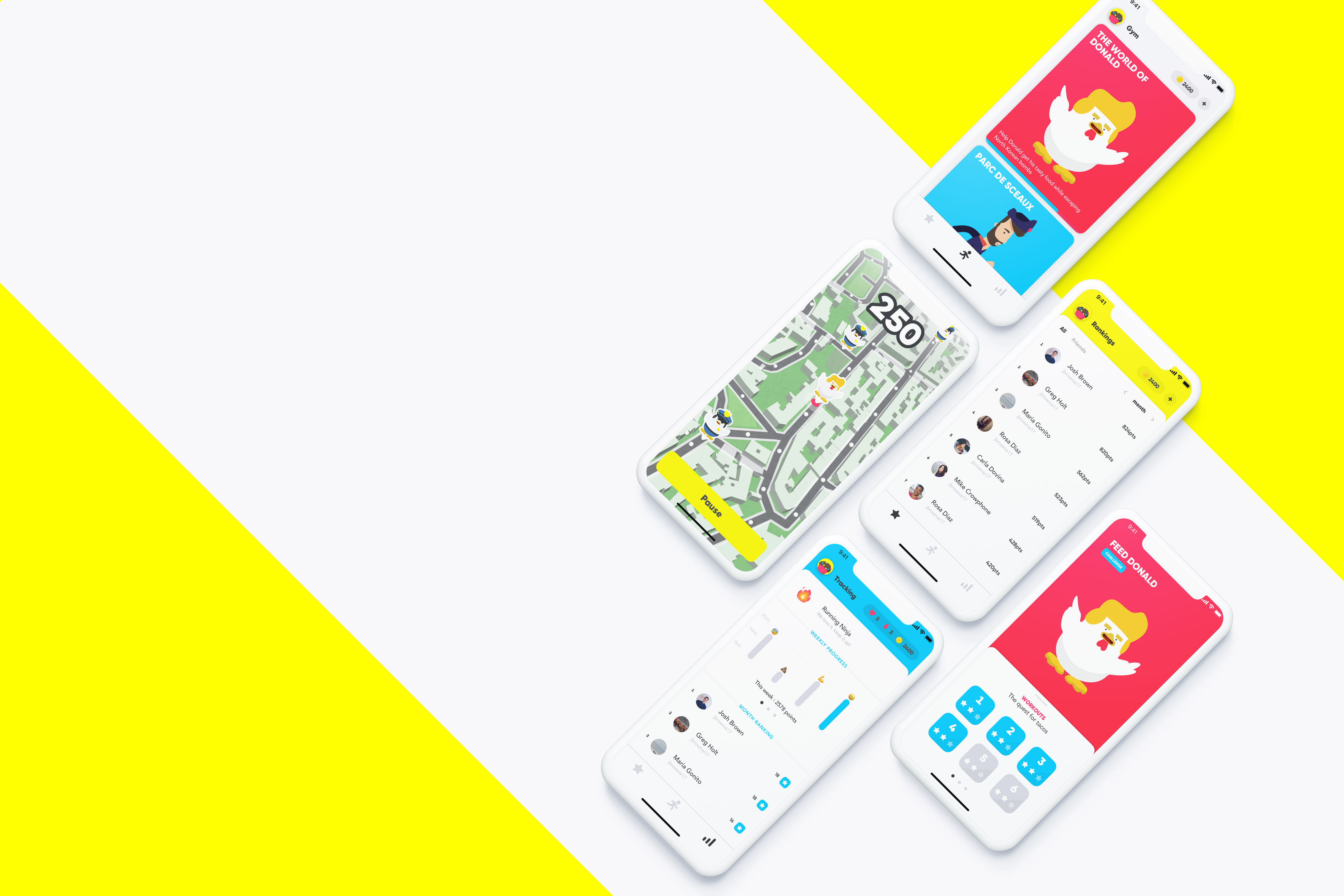
Our goal was to create an amazing experience that starts before the user goes running and continues after the run. Thanks to carefully crafted animations, we were able to bring our fun and interactive values to the app even before and after the run. Animated characters and emojis helped us achieve this result.
We then went on countless runs to test and find the best way interact with the game during a run. We ended up with an interactive map for users to see when walking, plus an interactive voiceover to listen to while running.


Kumpa was the first company I built; I created it while I was still in college. We were able to raise funds, build amazing diverse international team, win several innovation awards, and close deals with Europe’s largest media companies. After living through both the greatest and toughest moments of our lives, we decided to sell Kumpa in late 2018 to take on new challenges. This was an incredible adventure, both personally and professionally, and it created the groundwork for my current work, helping companies create simple and effective user experiences.